The Orlando Magic Unveil Rebrand
About two weeks ago, the Orlando Magic unveiled a rebrand that looks very familiar. As a day-one fan of the club, this made me giddy, because what we got was an updated version of the original look from 1989. The pinstripes are back, harkening back to the era of Shaquille O’Neal, Penny Hardaway, Nick Anderson, Dennis Scott, and originals like Terry Catledge, Scott Skiles, Greg Kite, Jeff Turner, and Reggie Theus. Sometimes, you have to go back to your roots.
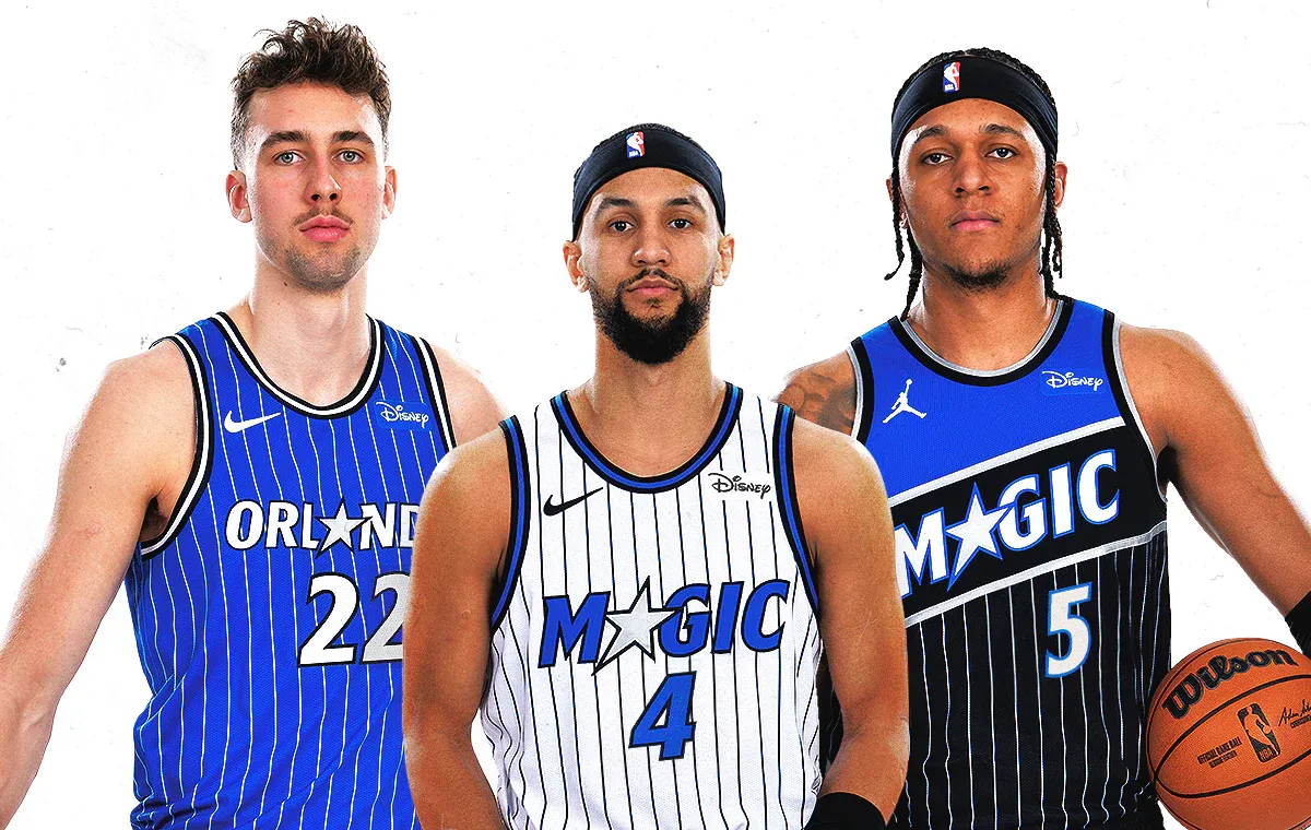
The color scheme is largely the same, though the shade of blue is much more bold than the muted blue they’ve used for the past 15 years. That new shade of blue really jumps off the white “Association Editions” uniforms, which include the signature black pinstripes and the Magic star replacing the “A” in “Magic”. The blue “Icon Edition” uniforms resemble the blue alternates released during the 90s with the white pinstripes and “Orlando” wordmark across the chest. Then, there’s the “Statement Edition” uniforms, which resemble the original warmup jackets the team used to wear. Personally, I’d like to see teams go back to wearing unique warmup attire as well.
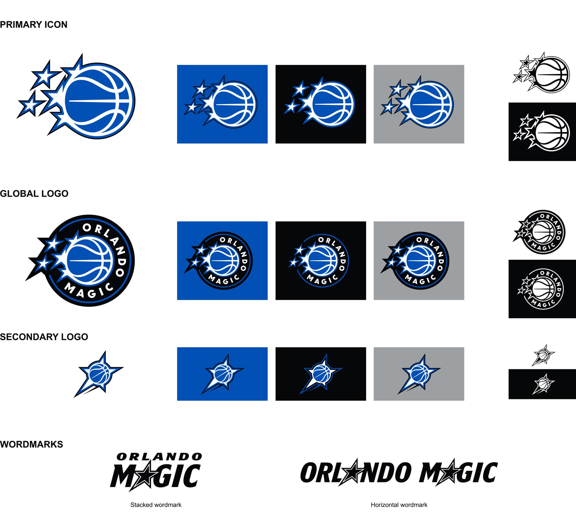
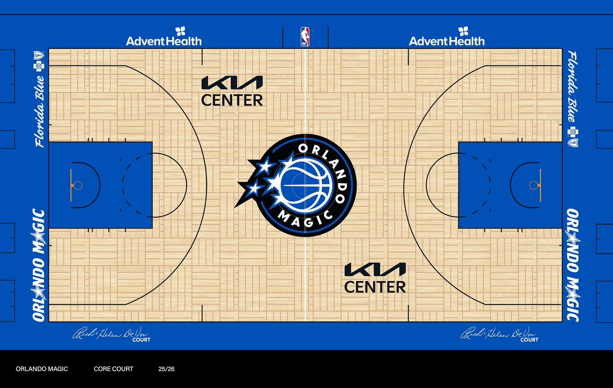
The logos resemble the original logo quite a bit, just feeling more cleaned up than the original. The word marks steered away from the brushstroke style the team used in the beginning, but I think it works. While managing to not flat out copy the original, they still have the feel. This translates to the court which also feels like the original, but with a modern twist.
The real test will be to see these in action, so I can’t wait to see what they look like on the court this year.