My Home Screen & Focus Mode Setups Heading Into iOS 26
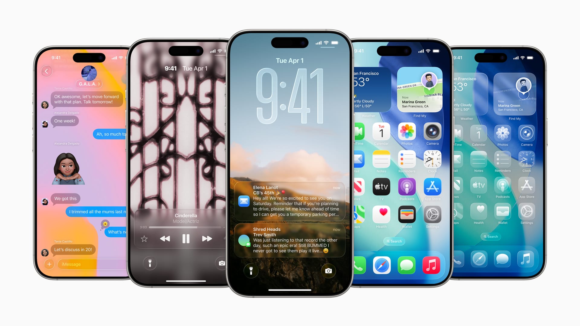
I’ve been cleaning some things up with the move to iOS 26 and to a new device in the coming weeks. I figured what time better than now to simplify my lock screen and home screen?
Lock Screen
The lock screen I see most of the time is this one of my cat, Griffey. I’m taking advantage of the new Spatial Image feature in iOS 26, which analyzes the depth in a photo and creates a 3D parallax effect, so as you move your phone it seems to make the image come to life. It’s my way of having my little buddy with me wherever I am.
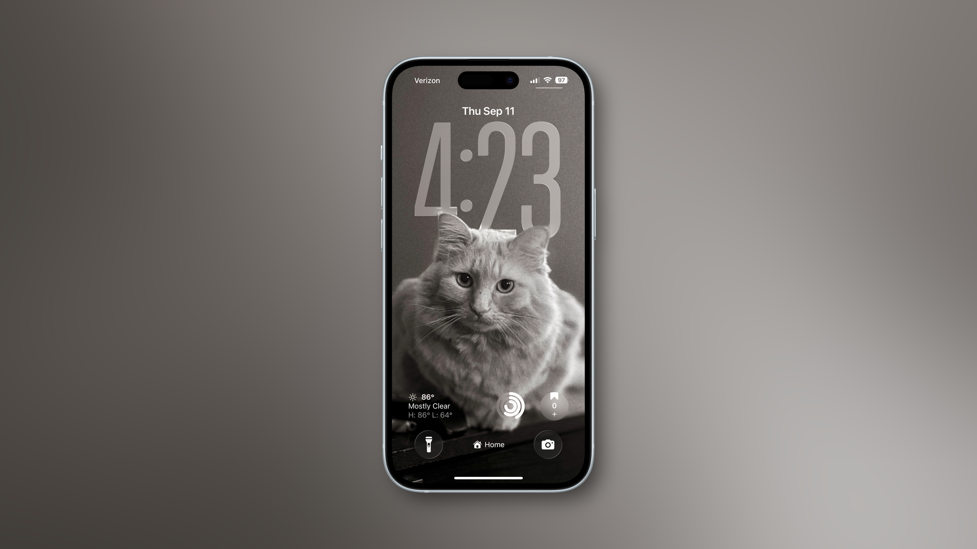
Another customization feature in iOS 26 is with the clock, as you can finally change the size of it vertically. By doing so even a little, the widgets move to the bottom of the screen, which is good for reachability on the bigger screens, but it also helps them get out of the way of a photo, if you’re using one as a background.
The widgets I’m using here are:
- Carrot Weather: My favorite weather app due to its level of customization, detail, alerts (how I know there’s lightning in the area), and for its Watch app.
- Activity: Keeping an eye on my rings, so I know if I need to get off the couch or not.
- Day One: My current digital journaling app. Apple’s own Journal app is closing in fast though.
I still have the default flashlight and camera shortcuts in the corners.
Home Screen
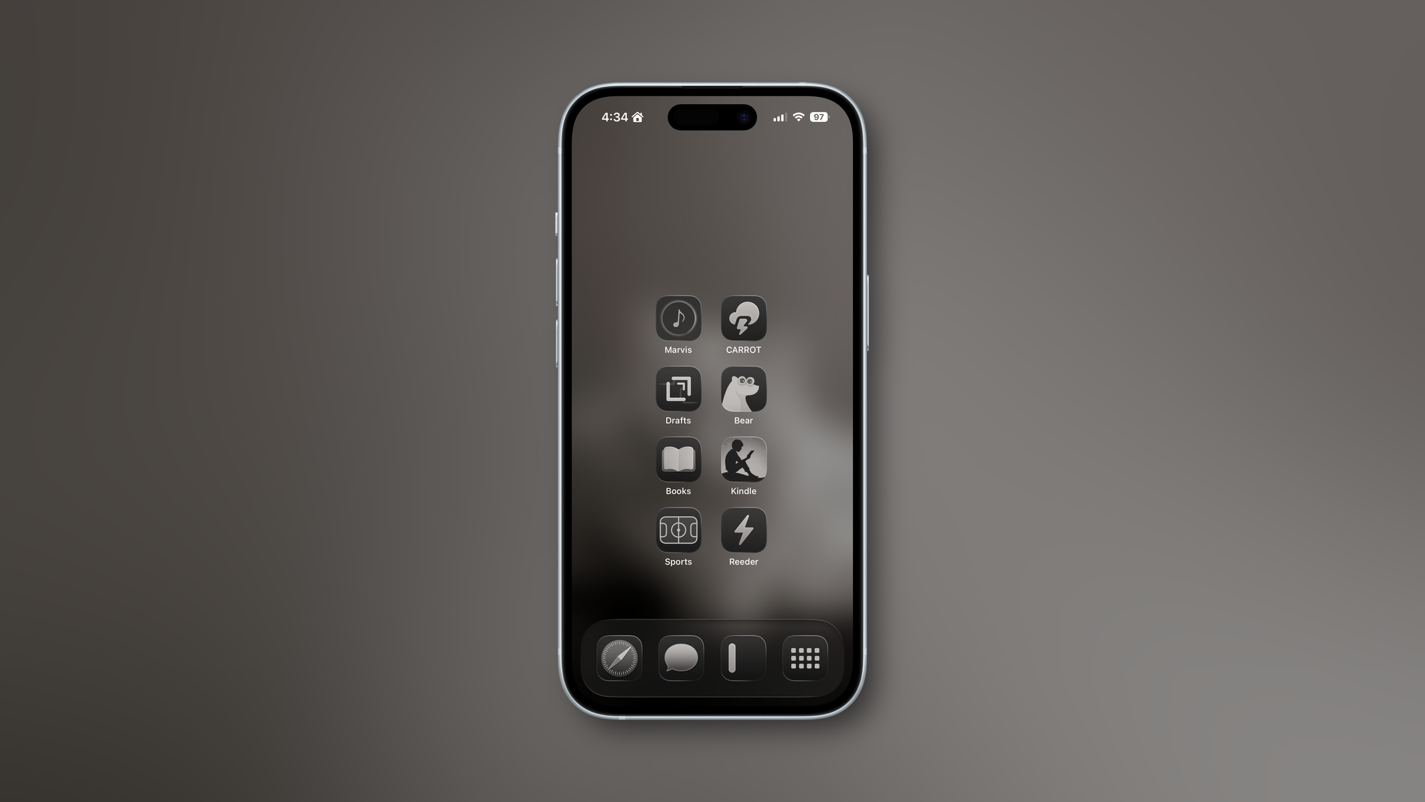
My Home Screen is set up both for making my device less distracting and for reachability. I’m moving to an iPhone 17 Pro Max soon, but even on my current 15, I wanted to make sure I didn’t need to reach to the top for much of anything. Combined with a lot of the UI updates in iOS 26, where search bars are on the bottom of the screen more often, I shouldn’t have to extend my thumb to the top of the screen for much.
I am using tinted icons for now, which change between light and dark modes depending on the time of day. However, Apple just added the option to tint the icons based on the color of your case, if you’re using one of Apple’s official cases. I may try this once I upgrade devices, so these may change to a sage green.
Going from left to right and top to bottom, here are my home screen apps:
- Marvis Pro: This is basically like an overlay for Apple Music. With this app, you can create your own custom dashboard for Apple Music and create smart playlists, complete with rules (like only playing music that hasn’t been played in the last 3 days) and the ability to combine multiple playlists together. It’s where I create custom radio stations for myself. I really need to do a write-up for how I used this app.
- Carrot Weather: Just spoke about this app above. It’s everywhere for me.
- Drafts: An app to take text and act on it. I haven’t used this app as much recently, but I will draft text messages up in this before sending them to the vendors I work with. It’s nice to work in a space with no timelines or inboxes, just text. Then I can click an action to send as a text message, and Drafts auto-populates everything but the name for me. It’s nice for emails too.
- Bear Notes: My current notes app of choice, but Apple Notes just keeps adding compelling features. Bear is much, much prettier though.
- Books: To read books with.
- Kindle: To also read books with.
- Sports: Apple’s Sports app, designed to make it easy to check a score and not much more. It covers most of the leagues I care about.
- Reeder: My RSS feed reader of choice. Basically, it’s a way to create your own newspaper. My only beef with it is that it’s a bit slow if you have a lot of feeds loaded into it, as there’s no service on the backend. I’m considering switching back to the now-named Reeder Classic, which does support backend feed reader services, in which I use Feedbin. It’s much faster.
In the dock, from left to right, I have:
- Safari: I know there are alternative browsers out there, but I don’t care. This does the job for me.
- Messages: Just the default texting app. End-to-end encryption is in most places now, and it’s not tied to Meta. It looks 100 times better than Snapchat, doesn’t take an elevator pitch to convince someone to use it like Signal, and is plugged into the OS. It’s hassle-free for me.
- iA Writer: The app I write blog posts like this one on. It’s available on all Apple platforms. It’s clean and stays out of the way when you need it to, but it has plenty of features packed into it.
- My version of Christopher Lawley’s ActionCut shortcut: This is a shortcut that’s actually meant for the Action Button on newer iPhones, but my iPhone 15 doesn’t have one of those, so this lives in the dock. This is a contextual shortcut that changes depending on the focus mode I’m in, so I have quick access to what I need in different situations. For example, there’s a menu that shows up only when I’m at work and nowhere else. This will leave my dock once I have the Action Button on the new device.
Control Center
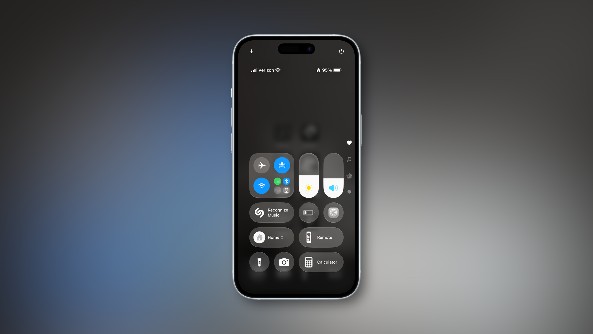
I’m not going to go into everything in the control center, as there’s nothing here that’s third-party. The main thing I want to show is again how everything is brought down to the bottom for maximum reachability. I have three pages of controls here: my main set, a page for media controls, and a page for my smart lights.
So, that’s how I have my iPhone set up at this current time. Maybe I’ll update this once I get my new device and have time to see if and how my approach changes once I have time to play around with things a bit.